After a successful product launch and an extended period of time in use by their sales team, the folks at Hello! Destination Management wanted to refresh their application.
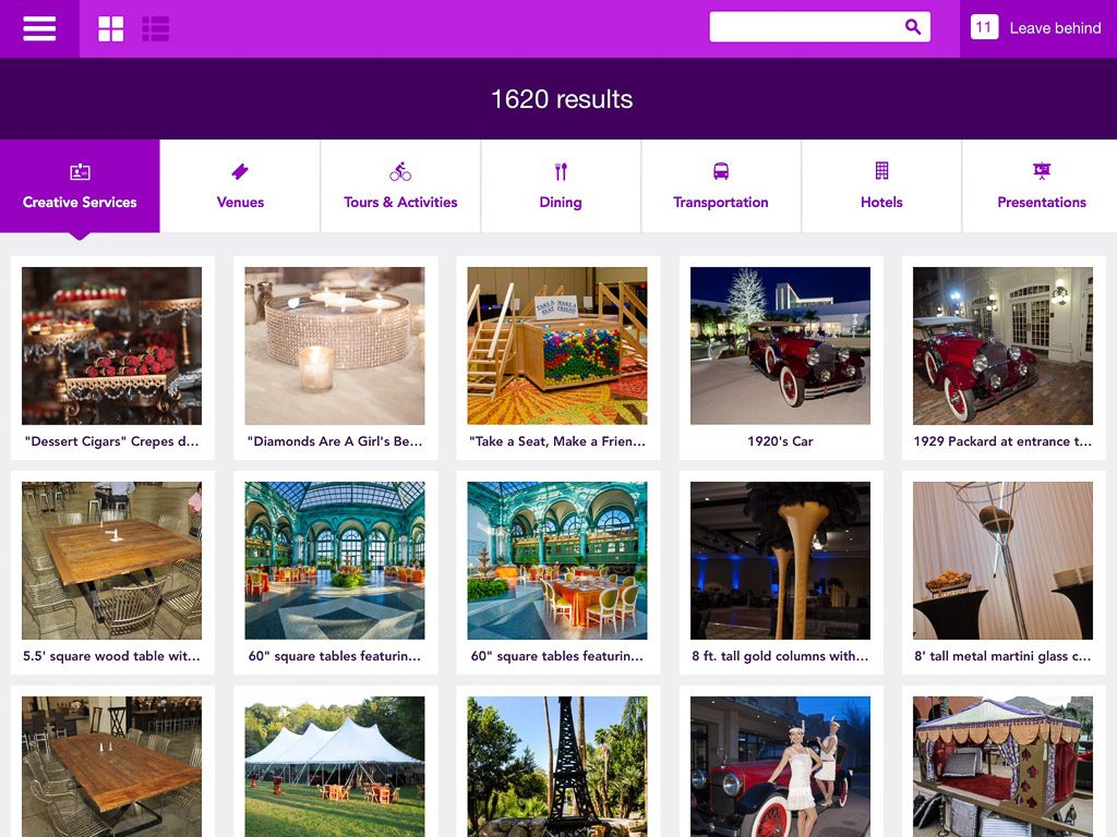
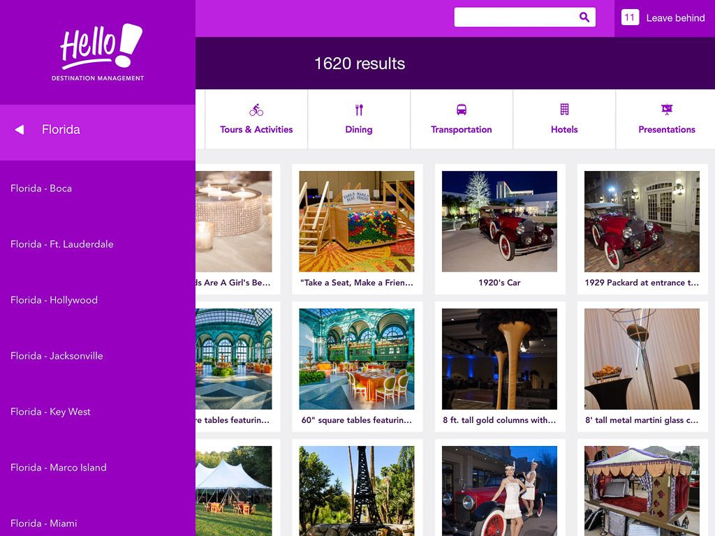
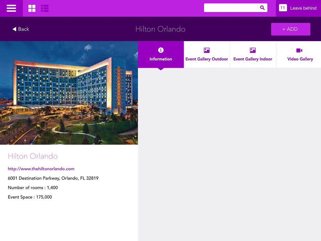
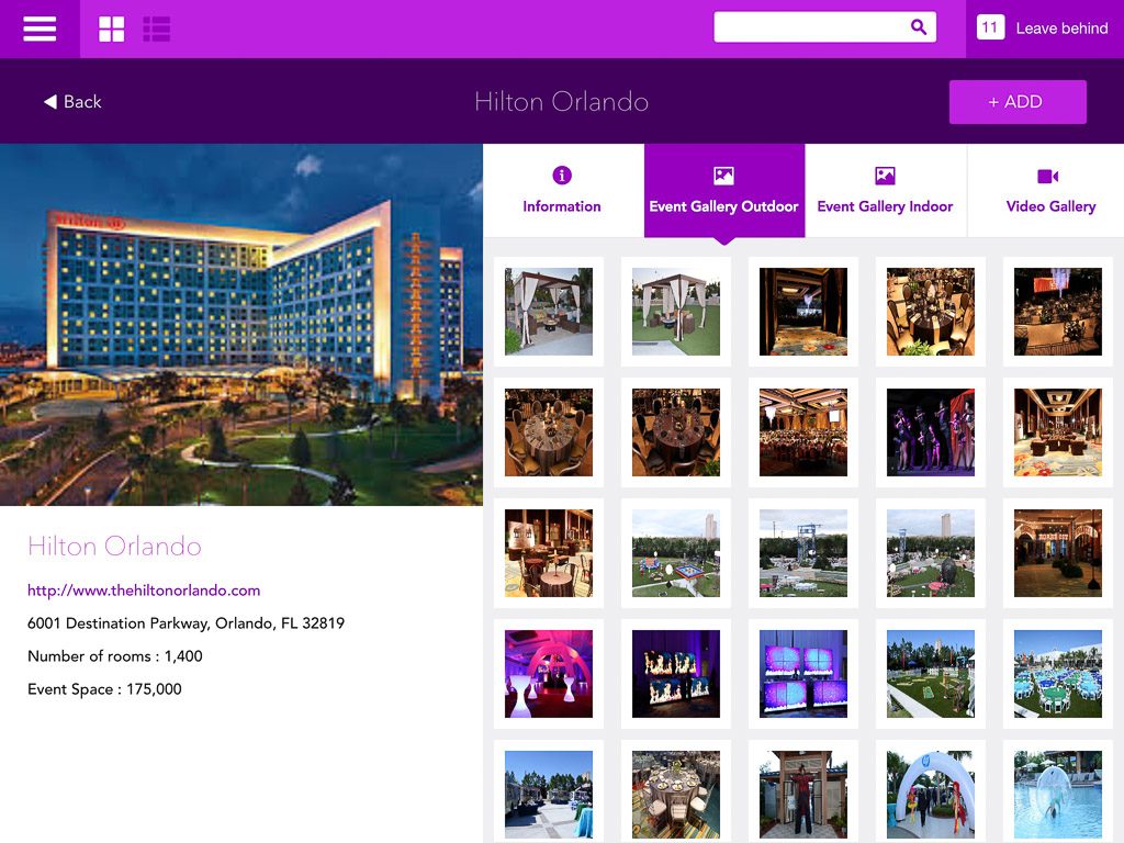
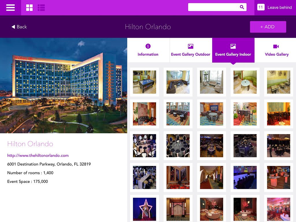
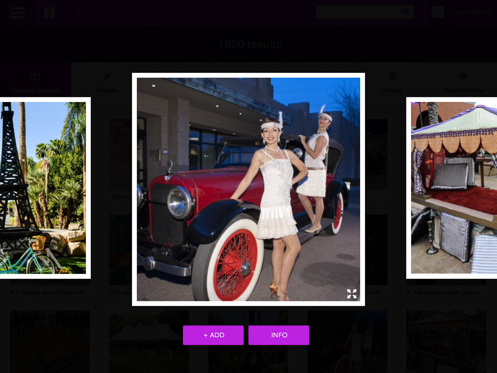
Push provided a compete redesign of the user interface, which would allow their sales team to better navigate the resource library, which had grown to tens of thousands of pieces of digital content.
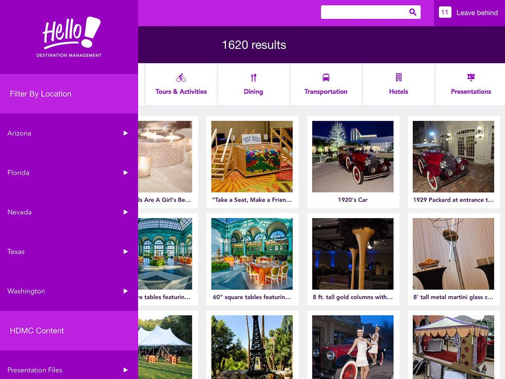
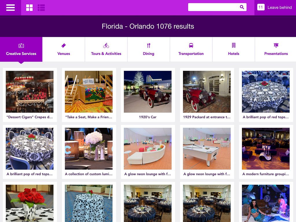
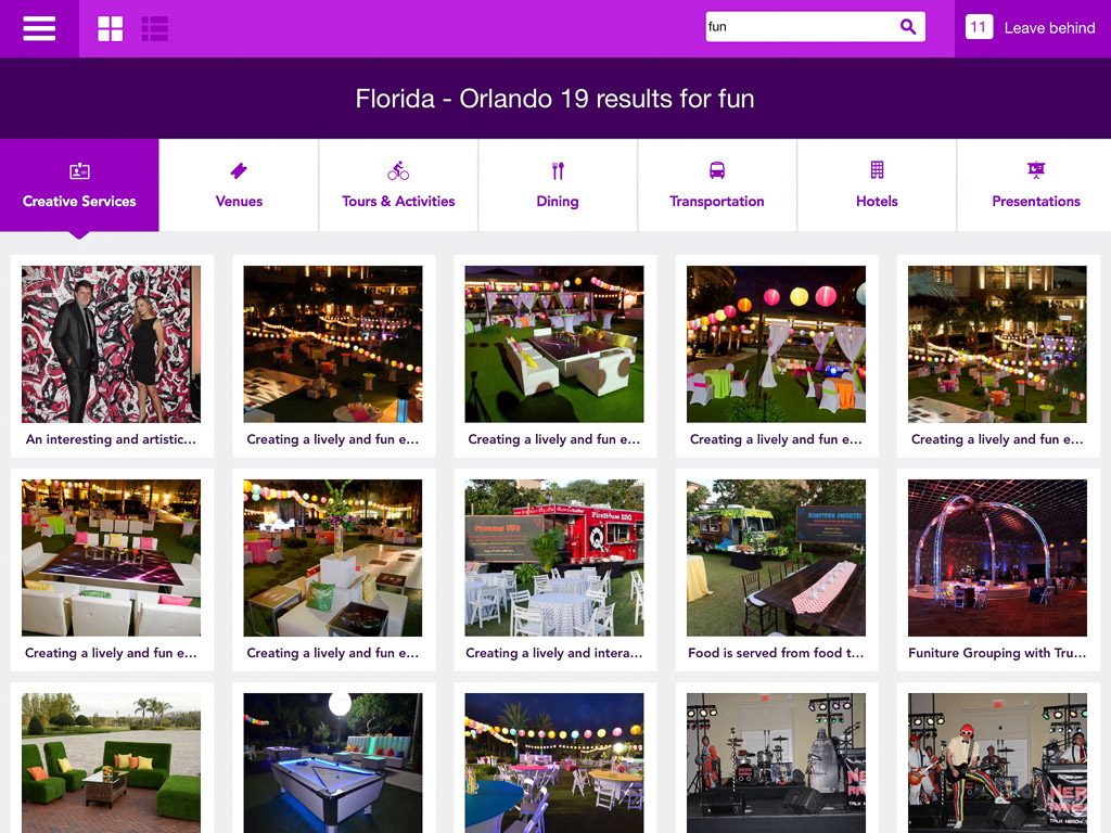
In order to handle the massive increase in data, some more advanced search and filtering capabilities were added, and the back end code was updated significantly. As the media library had grown so large, much of the work needed to be offloaded to background threads so that the user interface would always remain responsive.
In addition to redesigning the user interface of the iPad app, the CMS was also completely replaced with a much more capable system, which required all the communication code to be rewritten.
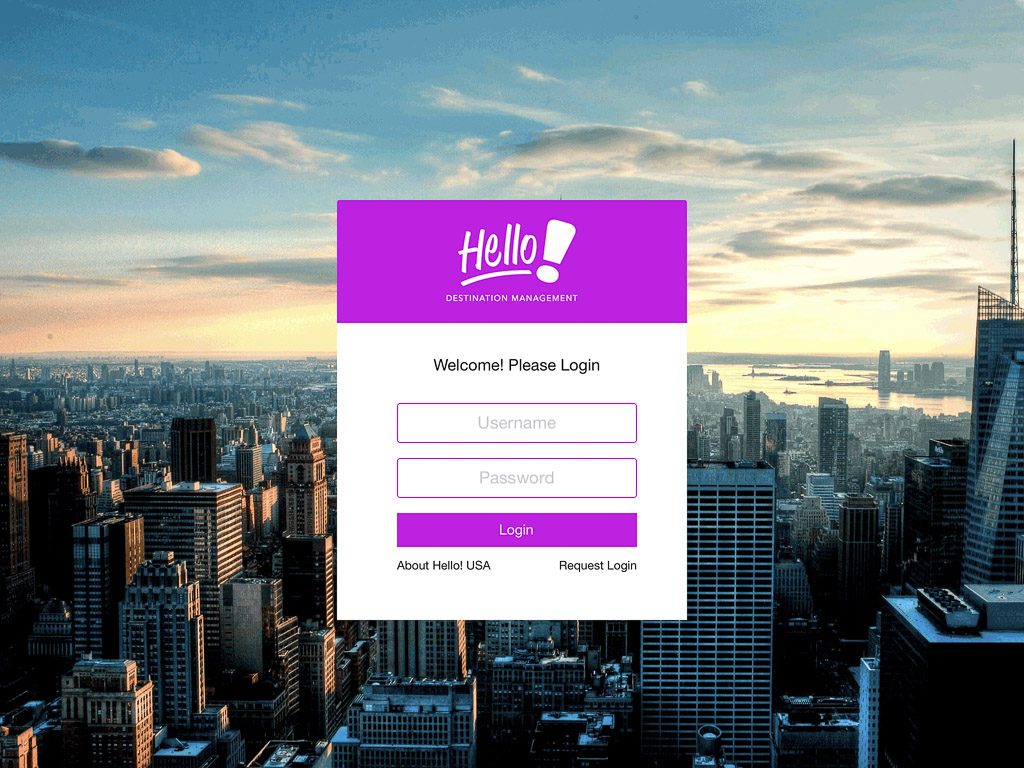
Below are some screenshots of the new interface design.
